The write-up below isn't exactly the same as the one found in the Data Sketches book. For the book we've tightened up our wording, added more explanations, extra images, separated out lessons and more.
Wow I don't know how to begin. This month has taken me so long it's embarassing, but I'm also super glad it's done - huzzah! When we first decided on the topic for February, I had intended to do something with BBC's Planet Earth 2. I had even started getting data for the first episode, jotting down which animals appeared when. But it didn't really go any further than that. (I think I wasn't excited enough about the topic for the amount of manual data entry it required.)
More than a year later, I've finished a piece for SFMOMA that I'm happy can also double for datasketches. I have to admit it's still sort of cheating - the data isn't about Nature, it's about texts sent to SFMOMA. But I'm looking at individuals' texts and their interactions with SFMOMA, so I'm hoping it can fit under...human nature hehehe. And plus there are flowers! So nature! I'm very thankful that Nadieh was ok with my little tweak to our rules - thank you Nadieh!
Last Last June, SFMOMA launched Send Me SFMOMA, a service where people could text a number requests like "send me love", or "send me art", and SFMOMA would respond with an artwork in their collection that best matched the request. They received 5 million texts from hundreds of thousands of people. Last October, they contacted me to do something with that data, and I was over the moon with excitement (bc SFMOMA!).
When I first started looking at the data, I did some simple exploration - what the attributes were, what keywords were most popular, what artworks came back the most often. I also knew that I wanted the end result to be a painting, bc I'm a cheesy individual and I wanted to make art out of art.

The idea I ended up pitching to SFMOMA was to trace an individual's "journey" throughout the month, what positive or negative thing they might have asked for, what kind of artwork they got back. I wanted to see if I can experience what that person experienced, and feel what that person felt.
Once I had the idea, the data part was quite easy - they gave me a huge file of all the texts they ever received, and another huge 1TB file of all the texts they ever sent back. From that second file, I wrote a simple script to get the first 100 individuals. I ran the keyword of each text through a sentiment library, and my cousin Max (a junior in college studying CS) wrote a script to get additional metadata - including date, title, artists, country of origin, color palette, Shannon Entropy - for each artwork from the SFMOMA API.
As far as data collection, prep, and cleaning went, this was probably one of the most straightforward months I've had while doing datasketches, for which I'm really happy about.
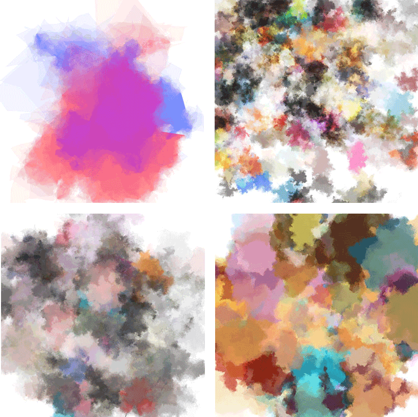
The very first thing I did once I had the data was to try and implement my own version of Tyler Hobb's watercolor effect. It didn't turn out quite well:

(The actual tweet that has some great responses)
But thankfully, Taylor Baldwin came to the rescue with a link to his own implementation, and later on Tyler chimed in with a fix. I was able to get my version looking more like Tyler's (top left in the screenshots below), but once I plugged in the actual data (where each blob is a color from an artwork that an individual got back), it was a mess again and I knew I had to try a different approach more than just watercolor blobs:
Around the time I was first working on this project, I had moved to Tokyo for 3 months. Japan is a country that reveres nature and the change in seasons, and in March when I first arrived, flowers were everywhere. I remember walking past this ad in a subway station and stopping and double tracking back because I just loved the whimsy and simple beauty of the flowers:

And I knew there and then that I wanted to work flowers and nature into the project (and when I also hatched the diabolical plan to turn a client project into a datasketches project yet again).

As soon as I got back in front of my computer/laptop, I jotted down my ideas for how to incorporate flowers into the visualization. At the same time, I started looking at the SFMOMA API to see what kind of data I could get back about each artwork. A few days later, I worked on the flower petals, taking what I learned from July film flowers about SVG curve commands, as well as newly learned functions like P5's randomGaussian and noise to get a (hopefully) more natural flower petal shape:

I especially loved the handdrawn effect I was able to get by using Perlin noise and varying the circle radius along the flower petal path, but unfortunately wasn't able to use it in the final visualization (it was just too computationally heavy especially when I was trying to draw dozens to hundreds of flowers).
So this is one of those months that prove that even if the data part goes smoothly and I know exactly what I want to do, the actual execution (code) can take a really really long time.

This was my very first attempt, where each text was a flower placed around in a spiral, and was colored by a watercolor blob. Not only was it aesthetically unappealing, it was so computationally heavy my Macbook Pro (with 16GB RAM!) was choking up. I immediately moved the watercolor calculation into a Web Worker so they wouldn't clog up the UI. I also got rid of the handdrawn petal path effect, because it was too subtle to appreciate when the flowers were at such small sizes and wasn't worth the CPU that it'd take to calculate them.
I didn't know how to deal with the aesthetics, until I went to the Joint Graduation Exhibition of 5 Art Universities in Tokyo at the National Art Center and saw this piece:

(I'm really sorry for the horrible quality of this photo, and for not remembering to take a picture of the artist's name and title of artwork.)
I was immediately taken by the cutout effect of the flowers, and I knew I wanted to try and recreate it:

I liked this effect very much, where the watercolor effects could mix together and there were cutouts for each flower. Around this time I also realized that having a flower for every text was just too much, so I decided instead to only have a flower for each positive text that was sent. I tried circles and squares for the neutral and negative texts, and eventually ended up with leaves.
But I was still unhappy with the layout of the flowers - for individuals who sent a lot of texts, they would overlap or be pushed off the edge of the screen. I was stuck for weeks on how to best layout each text (and worked on other projects in the meanwhile), until cherry blossom season hit in Tokyo. Suddenly there was pink everywhere, and it was gorgeous and emotional (I had lived in Japan for 6 years as a child and cherry blossoms are amongst my fondest childhood memories) and I basically spent the whole week going to different spots admiring cherry blossoms.

It was on one of those walks through Shinjuku Gyoen (one of my favorite parks in Tokyo) that I started to realize, I've been trying to layout the flowers in random ways but actually, they're flowers so they grow on tree branches. And tree branches are just fractals, and that's a very straightforward, very much solved computer science problem.

So I drew my flowers with branches, and I immediately loved it:

It took another two months after this point of tweaking to get to the final product. I added a slight curve to the branches to make them look a bit more natural, I made the flower petal shape less spiky, I fixed bugs...but most of all, I had a lot of trouble with the layout. I didn't like the amount of overlap of the flowers in the circular layout, so I moved to a horizontal layout:

But with this layout a lot of the tree was cut off, so SFMOMA suggested a carousel sort of format:

And I had it in this format for a while, but I really missed being able to see all the days of the week at the same time, and finally I adopted a layout with one day expanded and the rest smaller:

And this layout made me the happiest, not only because I could see all the trees at the same, but also because it was implemented with CSS Grid, it was perfectly responsive.
I then put together a legend for how to read the visualization (also implemented in CSS Grid!) and an introduction to the project for the final version:

I love this project so much because it had so many learnings and firsts: I learned Vue around this time, so all the data updates and interactions are managed in Vue. I successfully used a Web Worker, and I learned CSS Grid to layout all of the trees. It will also always remind me of all the experiences I had in Japan, since my stay there deeply influenced the form of this visualization. I'll always have little tweaks I want to do (I'm never 100% satisfied with my projects), but it's one of those projects where I'm really happy with the outcome.
When we first decided on the topic of “Nature”, I wanted to do something with the BBC's Planet Earth 2. I even started gathering data for the first episode, jotting down which animals appeared when, but it didn't go any further than that. (I really wasn't excited enough about the idea for the amount of manual data entry it required.)
More than a year later, I had finished a piece for SFMOMA that I thought could maybe double for Data Sketches. I have to admit it's still sort of cheating; the data isn't about nature, it's about texts sent to SFMOMA. But I looked at individuals' texts and their interactions with SFMOMA, so it could fit under...human nature (*≧▽≦). I'm very thankful that Nadieh was okay with me bending our rules a little bit (again).


